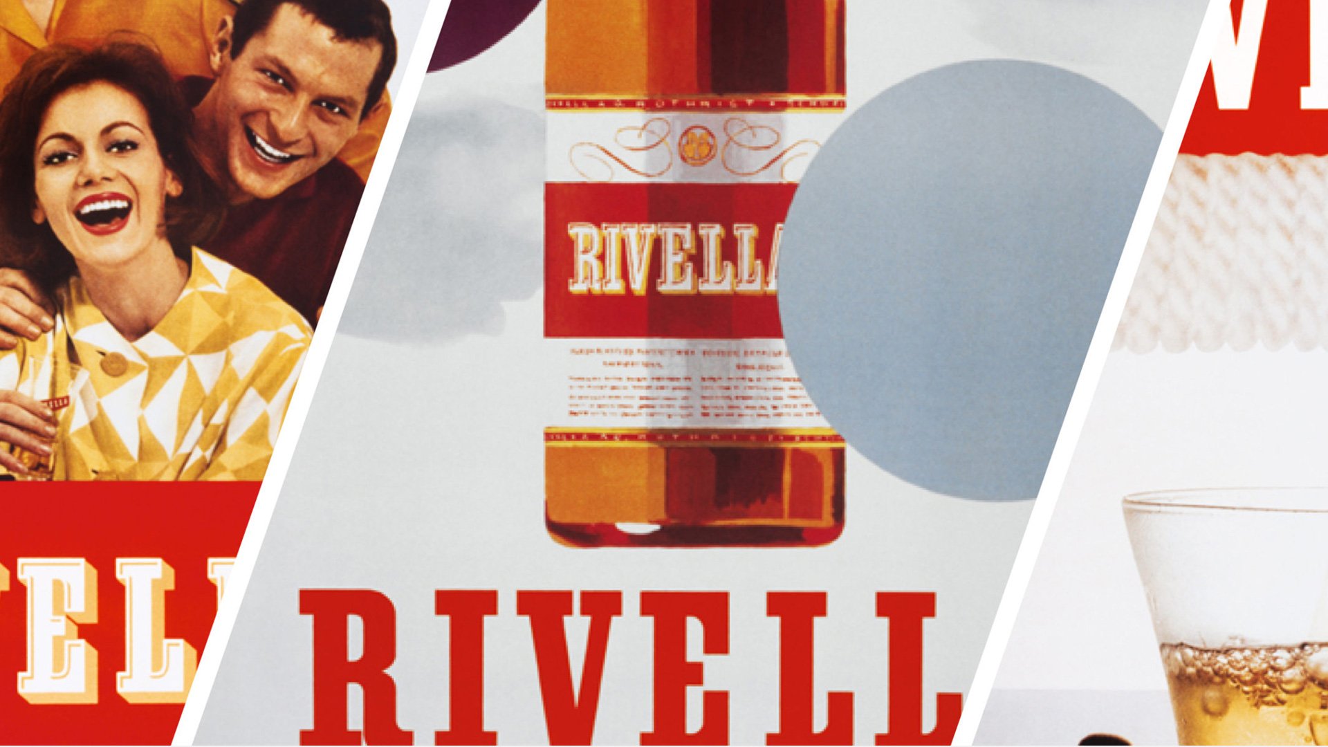
Rivella is a unique brand in that it is completely localized to Switzerland – but those who grew up with the brand know how deeply rooted it is in Swiss culture. We worked with the Rivella team to modernize the brand without losing the emotional connection its consumers have developed over the past 60 years of their history – holistically refreshing the positioning, story, and subsequently every touch point, from the logo, labels, to the bottle.
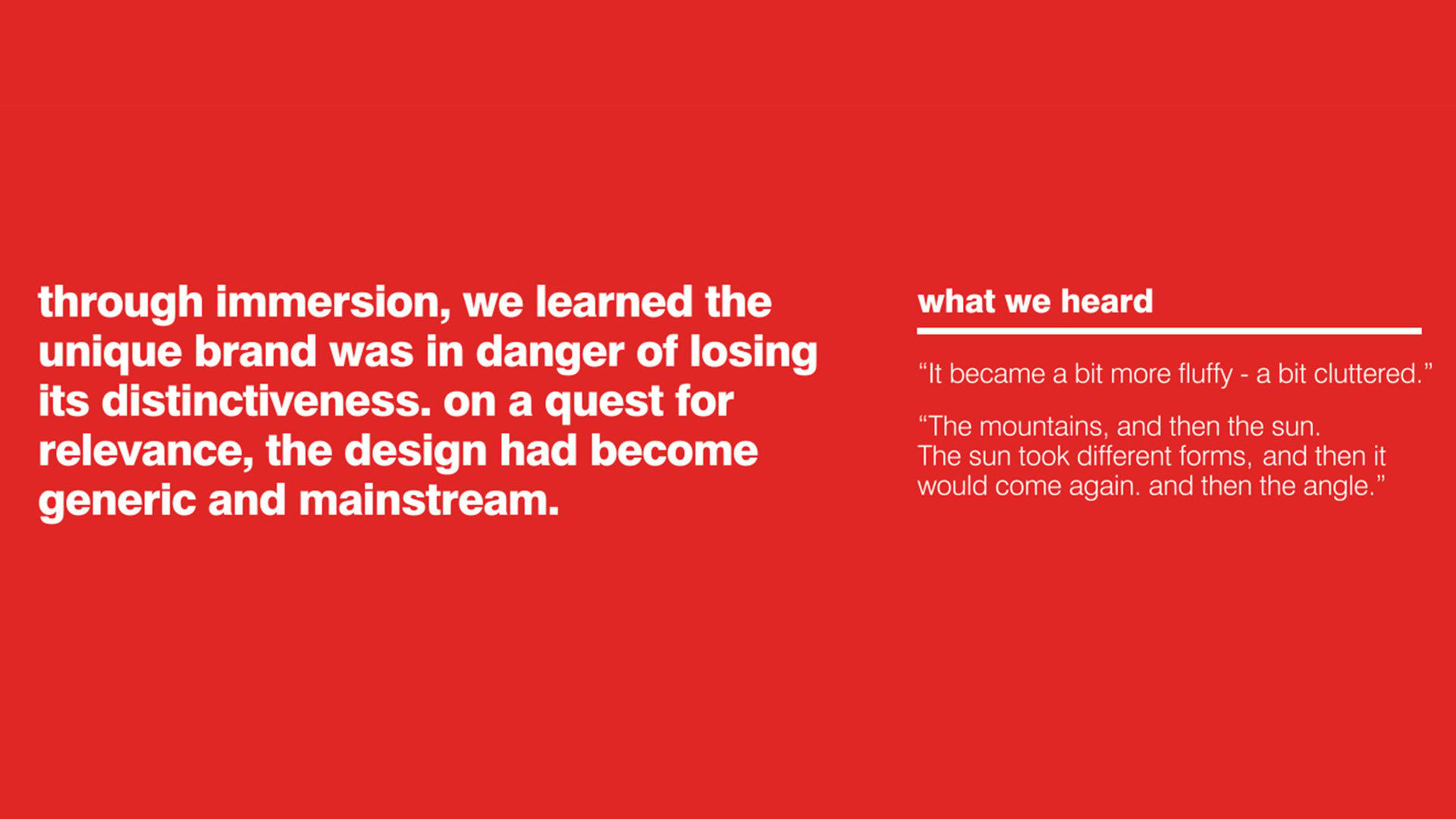
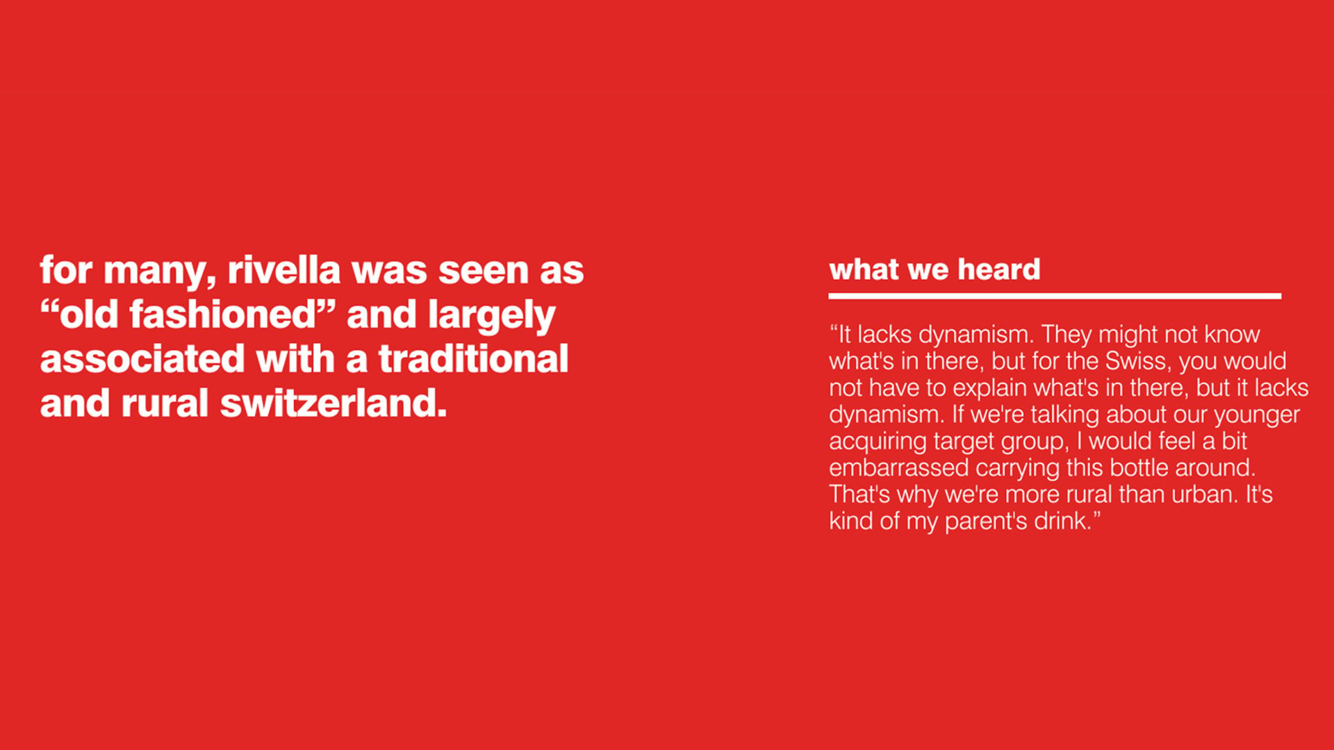
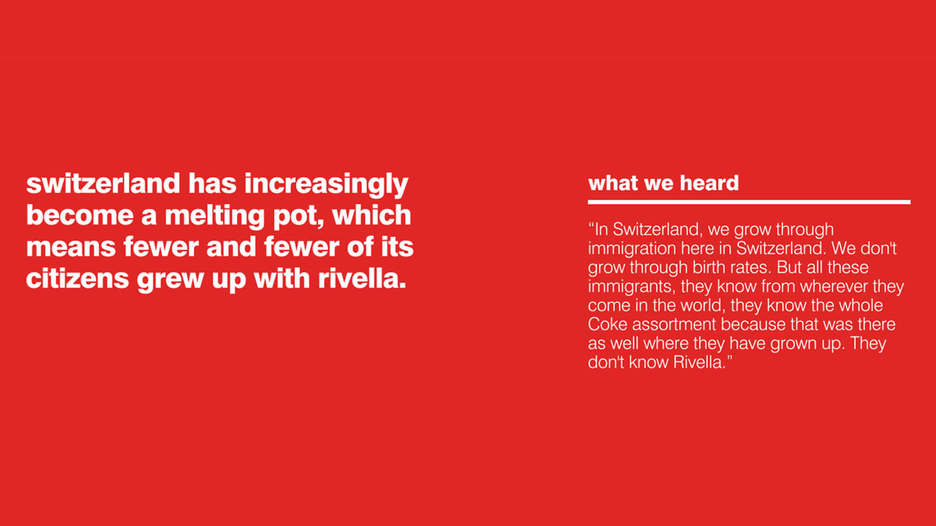
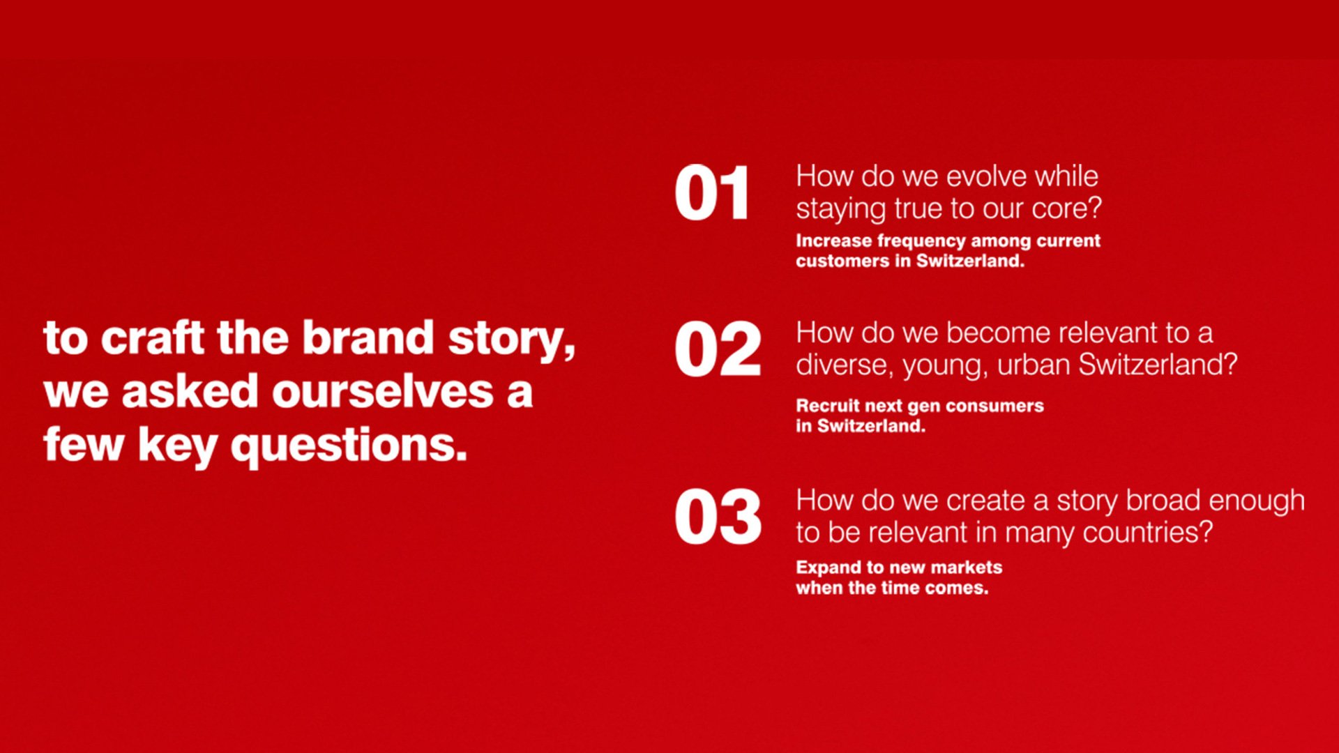
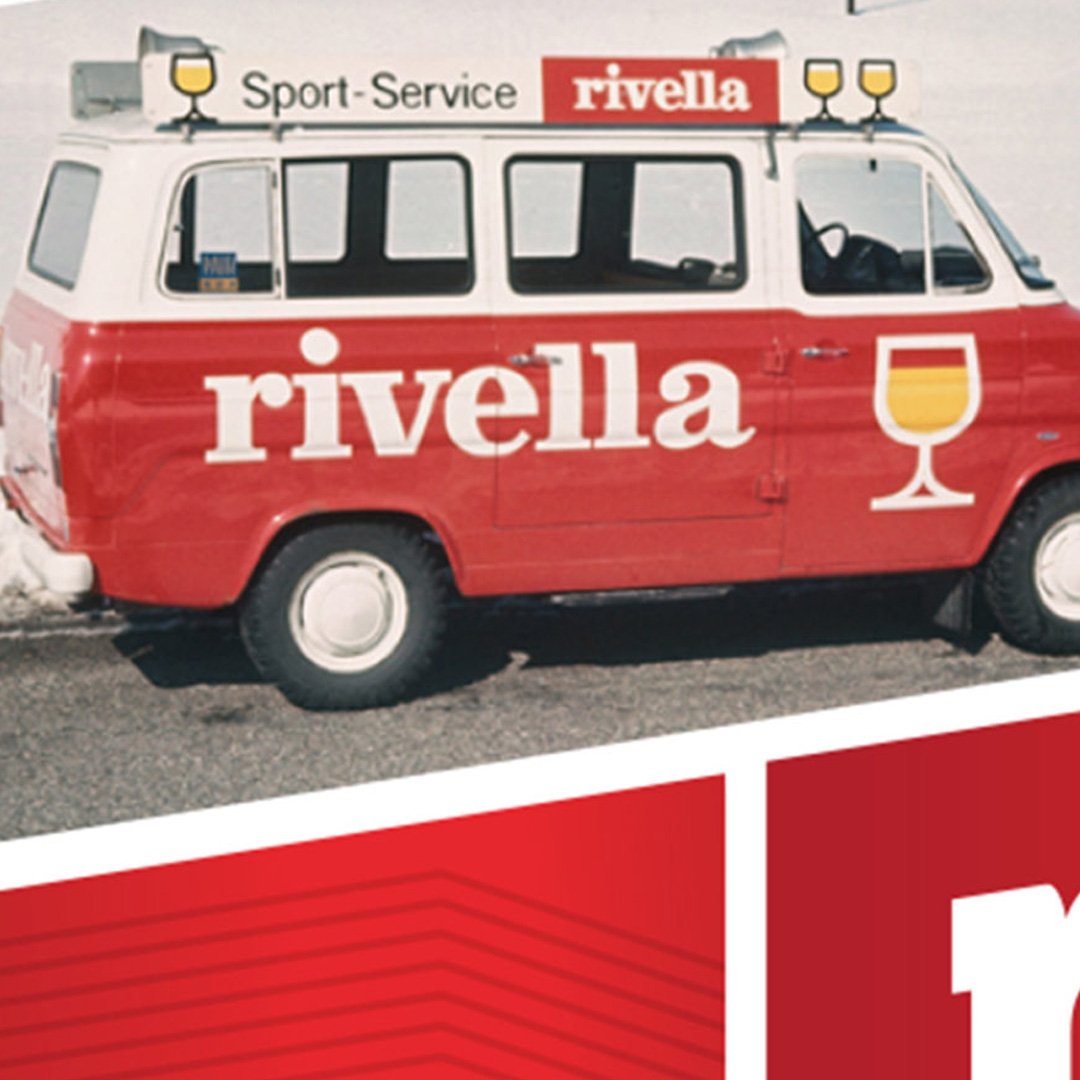
In repositioning Rivella, we engaged with consumers and stakeholders to pinpoint what makes the beverage so loved within Swiss culture. Rivella is a traditional family brand, long associated with an active lifestyle and the refreshing feeling of a drink after skiing or being in the mountains. However, Switzerland has increasingly become a younger country, and, along with younger generations, they don’t have the same memories growing up with the beverage. The brand had become generic, mainstream and lacking a point of view that engaged a new generation of consumers.
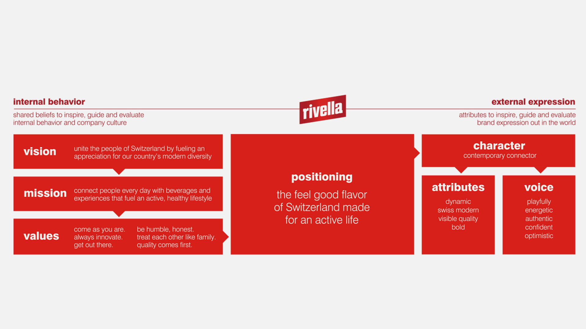
What we uncovered within the walls of Rivella, though, is a pioneering culture, inspired by Switzerland’s new diversity. Working with Rivella, we developed a vision, mission, and values to propel their new role within Swiss culture – that of a champion of new ideas and diversity. Furthermore, we refined Rivella’s positioning to focus on the beverage’s bold, unique taste, mirroring the values of a bold, diverse generation of Millennials, and Rivella’s next-gen consumer.
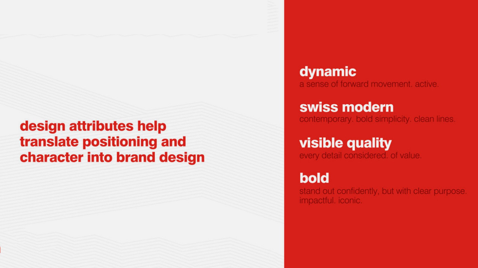
From there, we translated the positioning into specific design characteristics – dynamic and bold, but with subtle attention to detail, and, most importantly, a design that embodies modern Switzerland.
Our goal was to balance simplicity with refined detailing, sophistication with activeness. We started by understanding the iconic role mountains and the Swiss flag play in the Rivella narrative; from there we created a modern interpretation of these elements that was abstract rather than literal, while remaining holistic to Rivella’s heritage.
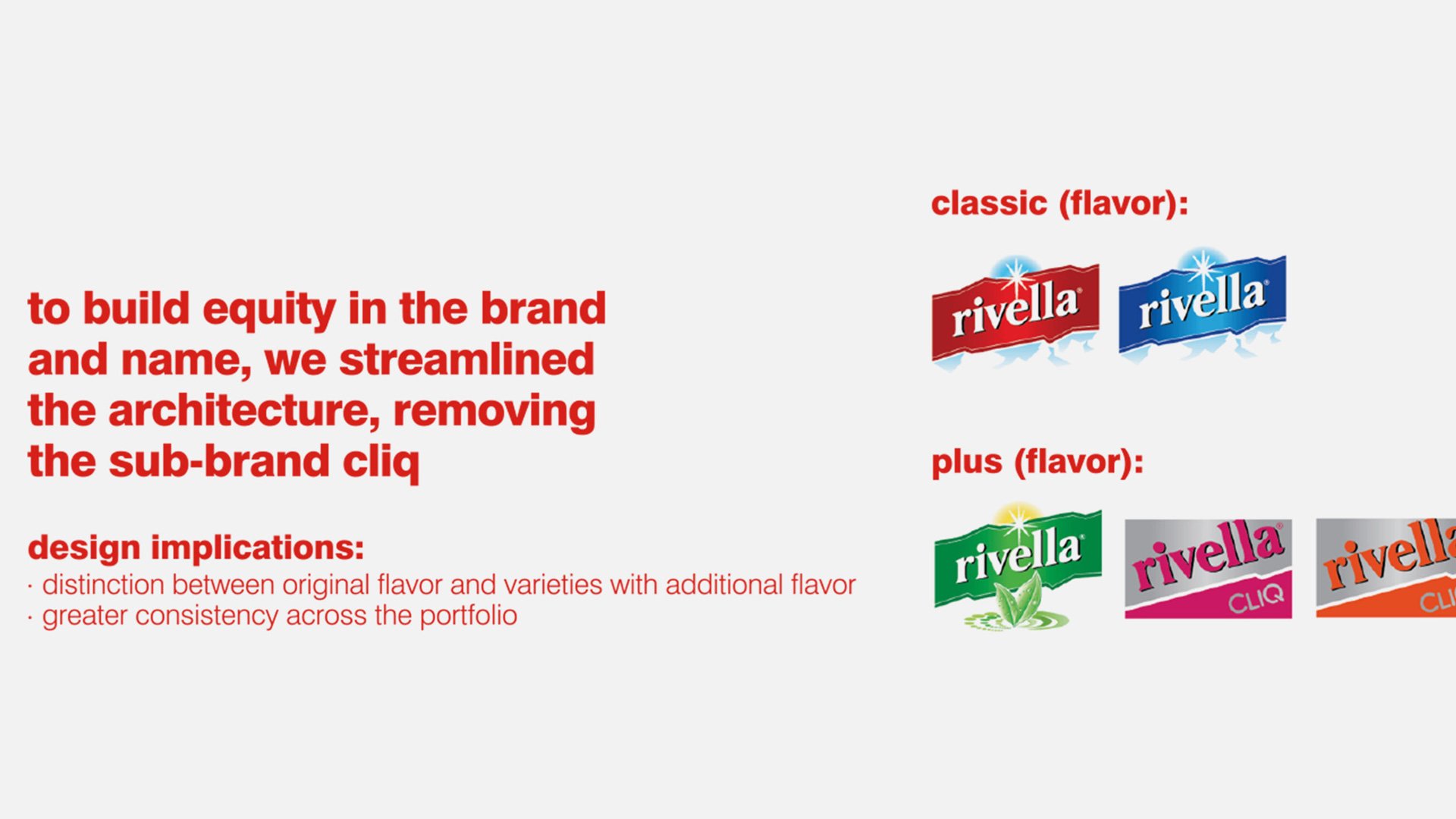
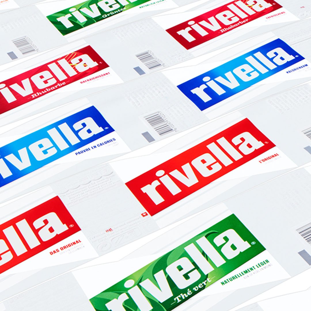
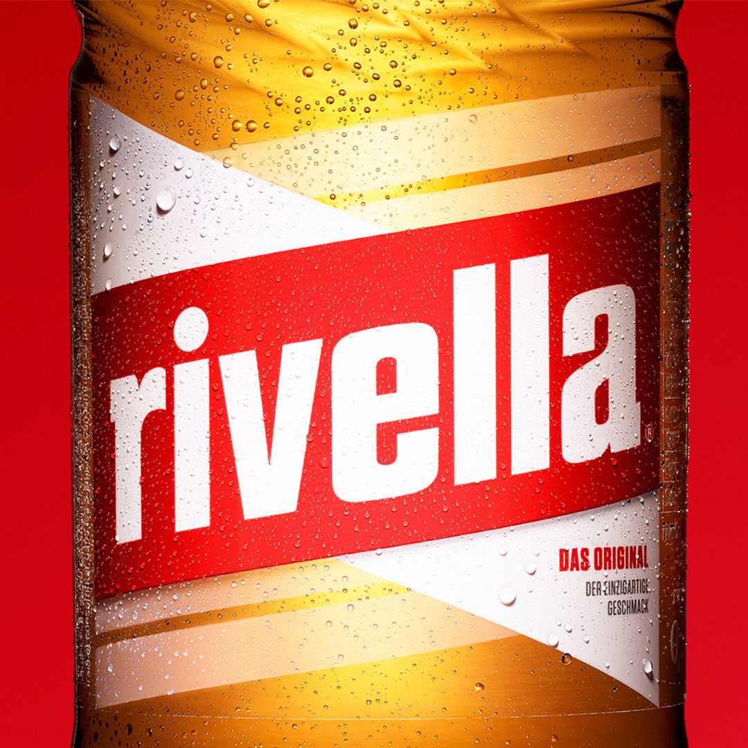
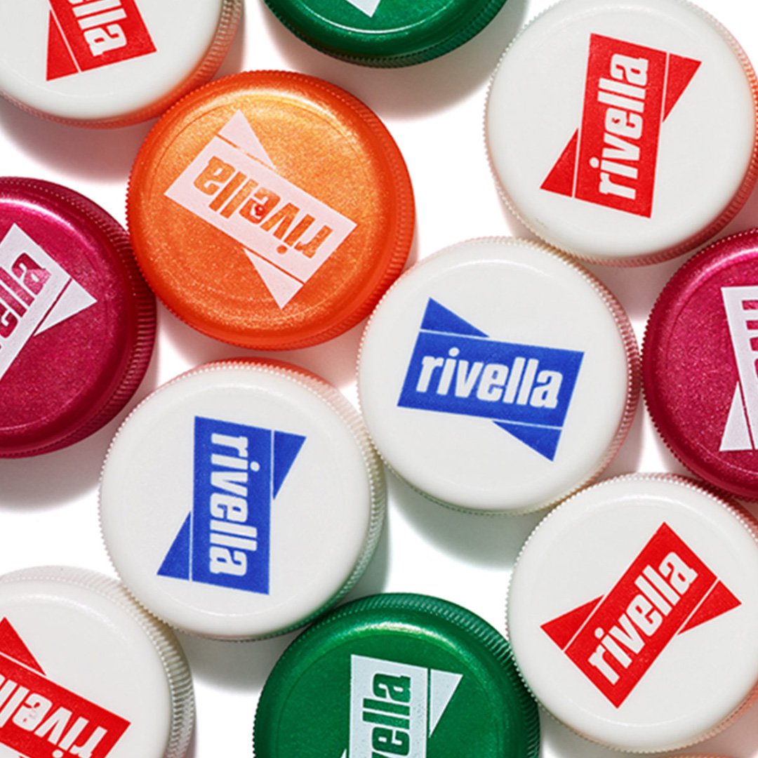
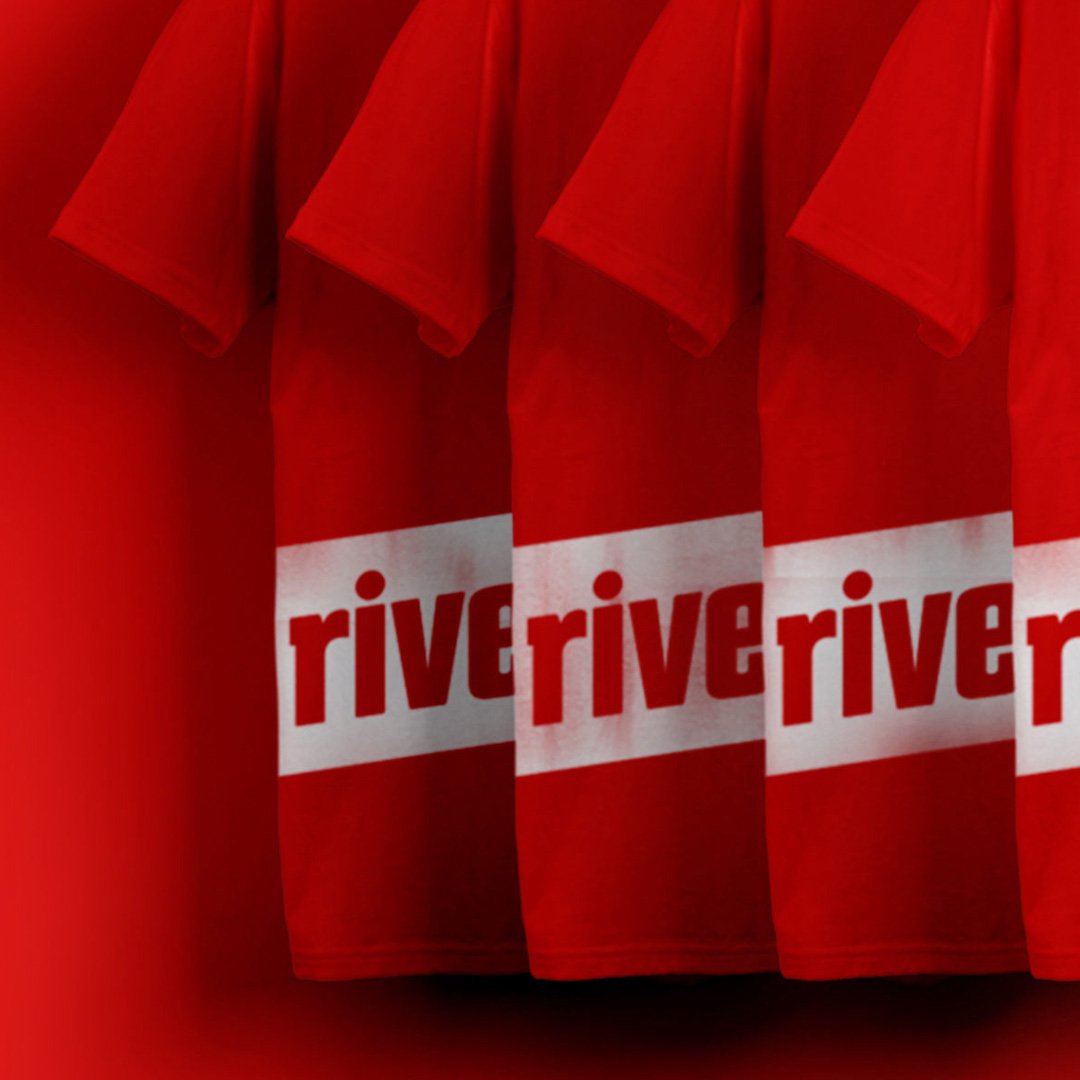
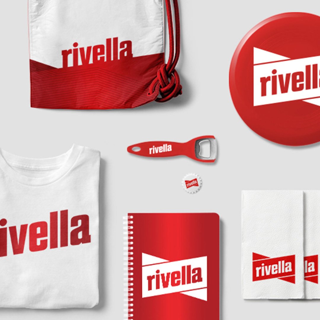
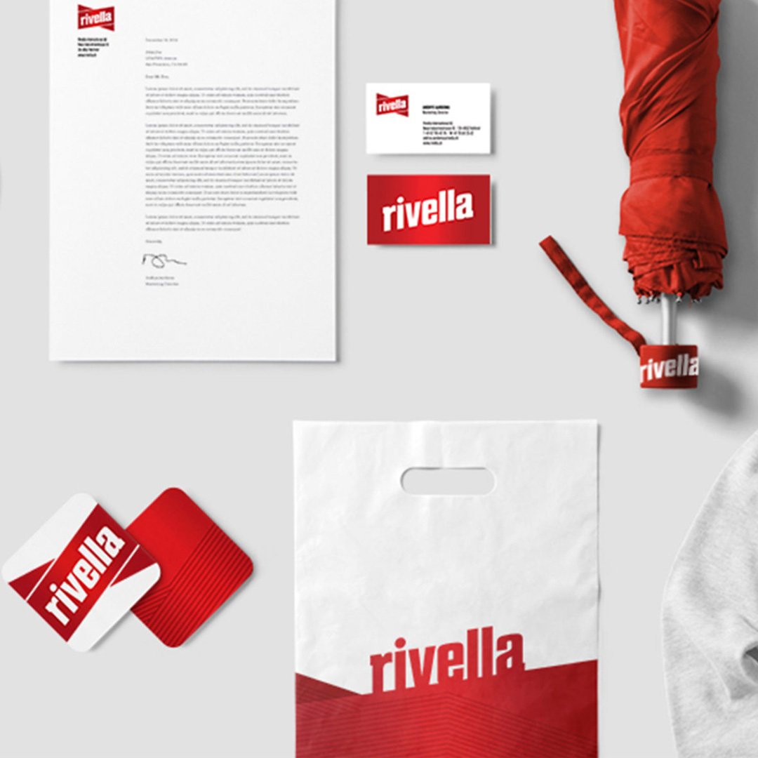
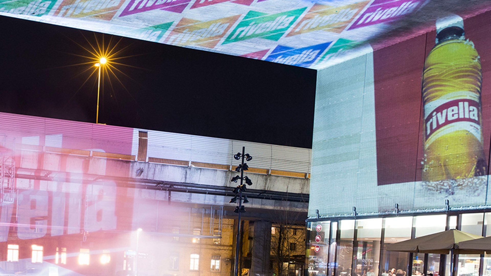
The new logo is meant to boldly symbolize Rivella’s unique role in fueling an active and modern lifestyle, set to life with a custom bold sans serif against a dynamically angled container in Rivella’s iconic red color. We selected Tungsten as the brand’s font for its simple and compact, yet playful nature; the type is confident while still friendly and approachable. Two tones of red add dimension and visual interest to its heritage red and white color palette. From there, we deconstructed the new label into simple shapes and active directional lines to create a visual language that integrates the brand across a selection of collateral, event marketing materials and packaging.
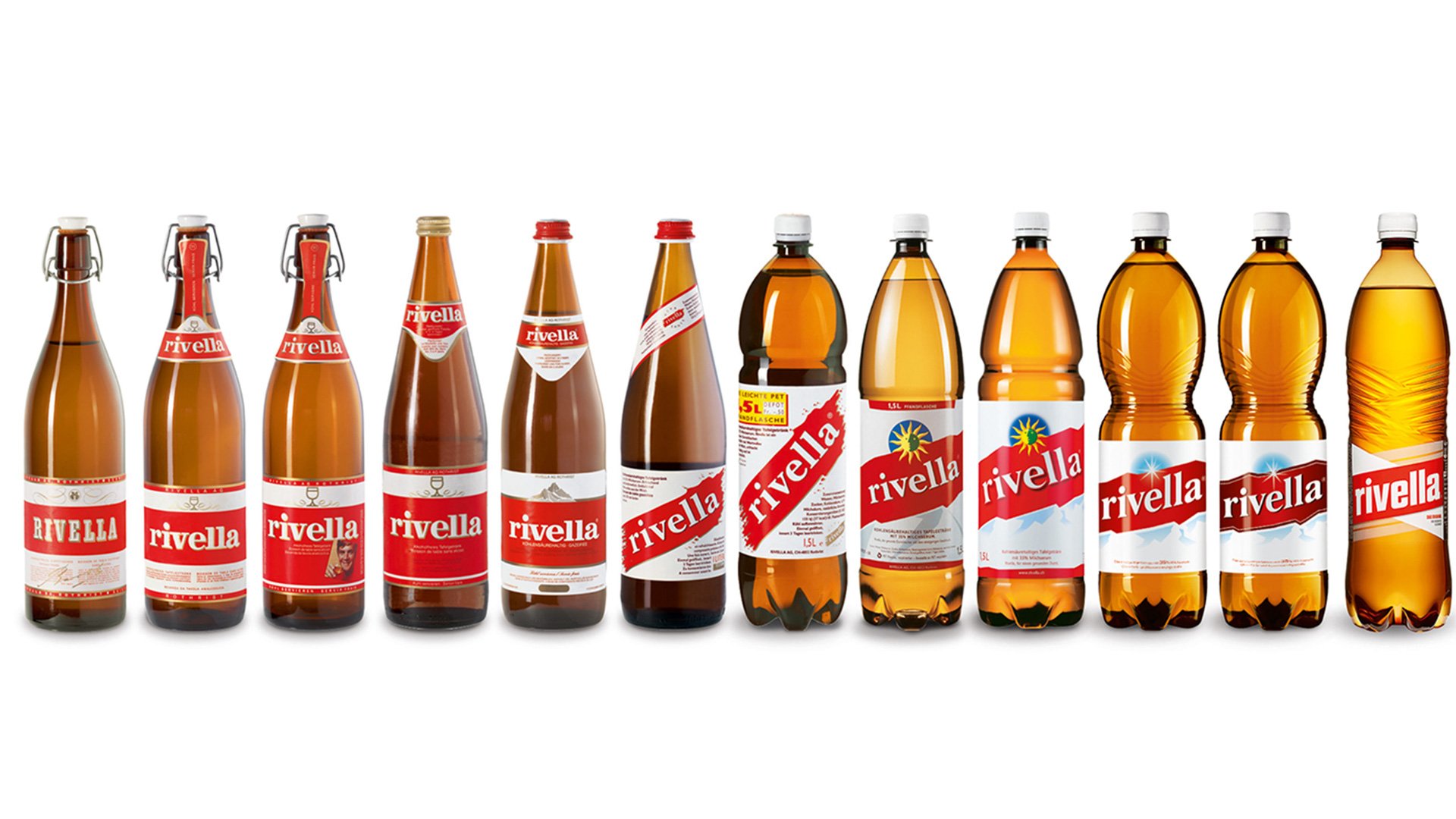
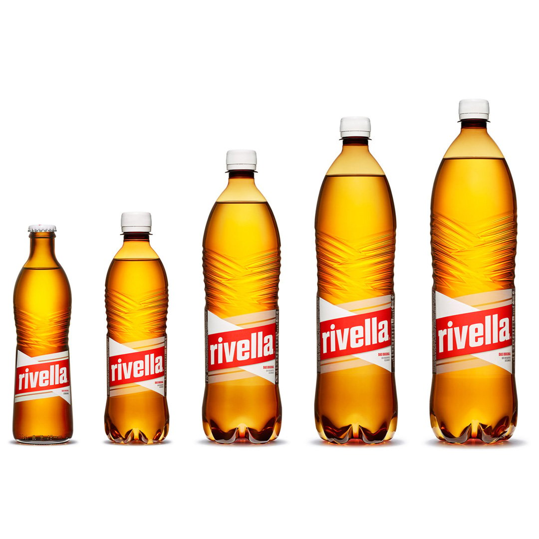
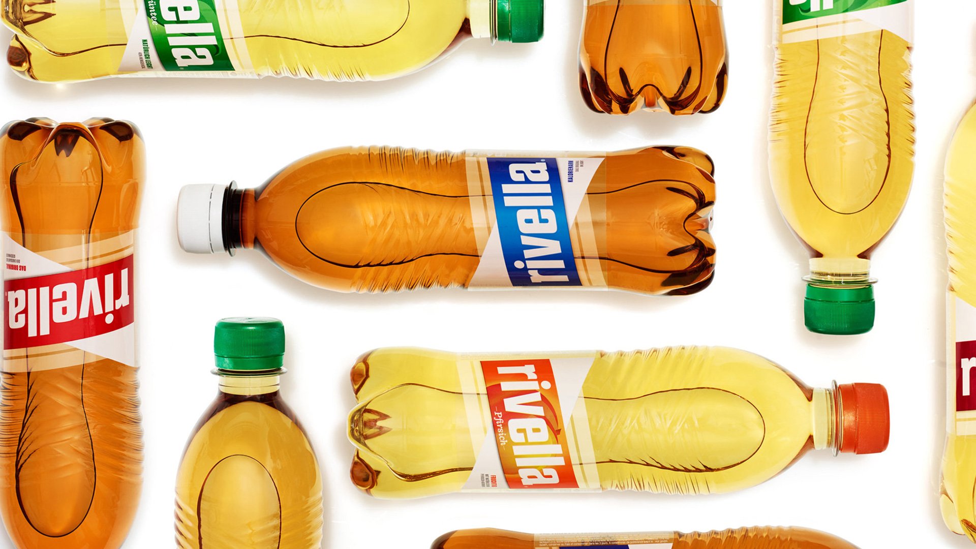
In conjunction with refreshing Rivella’s heritage logo, we refined the existing bottle to enhance the new visual language. Having both industrial and graphic design disciplines work closely together in tandem, we were able to create a die-cut label that perfectly aligns the parallel overlapping textures of the bottle. The label feels seamlessly integrated into the bottle, with beautiful ridges and a tapered body perfect for gripping.